Branding
Case Study
Amanda Malkin

Categories
- Branding
Amanda Malkin is a certified nutritionist dedicated to helping individuals achieve optimal health and wellness through personalized nutrition plans and holistic lifestyle advice. With a growing client base, Amanda recognized the need for a professional brand identity that would reflect her expertise, approachability, and passion for nutrition.
Creative Process
-
Develop a professional and cohesive brand identity for Amanda Malkin.
-
Create a logo that reflects Amanda’s expertise and approachability.
-
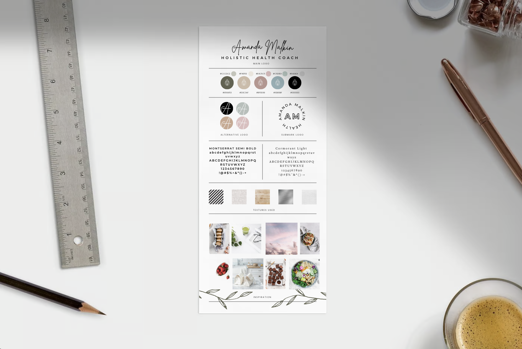
Select complementary colors and fonts that align with her brand values and vision.
-
Provide professional logo files in various formats for versatile use.
The goal was to create a logo, select complementary colors and fonts, and deliver professional logo files that Amanda could use across her marketing materials and online presence.
Initial Consultation
We began with an initial consultation with Amanda to understand her vision, target audience, and brand values. Amanda emphasized the importance of conveying a sense of health, wellness, and trust through her brand identity. We also discussed her preferences and any specific elements she wanted to incorporate into the logo.
Concept Development
Based on the insights gathered during the consultation, we developed two custom logo concepts for Amanda to choose from. Each concept aimed to capture the essence of her brand while offering a unique visual representation. The concepts included:
-
Concept 1: A modern and clean design featuring a stylized leaf, symbolizing growth and natural health, combined with a sleek typography treatment.
-
Concept 2: An elegant and approachable design with a focus on a holistic approach, incorporating subtle organic elements and a friendly, rounded font.
Revisions and Refinement
Amanda selected Concept 1 as her preferred logo design. We then worked through up to three rounds of revisions to refine the logo, ensuring it perfectly aligned with Amanda’s vision and preferences. Adjustments included fine-tuning the leaf design and experimenting with different font styles to achieve the desired look and feel.
Complementary Colors and Fonts
To create a cohesive brand identity, we selected complementary colors and fonts that would work well across Amanda’s marketing materials. The chosen color palette included soothing greens and earthy tones, reflecting health and natural wellness. The fonts were chosen for their readability and professional appearance, ensuring they complemented the logo design.
Delivery of Professional Logo Files
Once the logo design and complementary elements were finalized, we provided Amanda with professional logo files in various formats, including vector files (EPS) and high-resolution PNG and JPG files. These files ensured Amanda could use her new logo seamlessly across different platforms and marketing materials.
The Results
The Mini Branding project for Amanda Malkin resulted in a professional and cohesive brand identity that effectively conveyed her expertise and approachability.
Key achievements included:
-
A visually appealing and memorable logo that resonated with Amanda’s target audience.
-
A cohesive color palette and font selection that enhanced the overall brand identity.
-
Positive feedback from clients and peers, praising the professional and approachable design.
-
Increased brand recognition and trust, contributing to the growth of Amanda’s client base.
Ready to Build Your Brand?
Let’s turn your vision into reality – partner with us and watch your brand soar!

